Does affiliate marketing work? Do the math(s)

I’m a sucker for get-rich-quick schemes, especially when they don’t work. Odd that. If you haunt certain communities such as the Warrior Forum, you will be overwhelmed by offers to make you rich within hours/days/months, These generally focus on affiliate marketing, and the model is usually thus:

  • identify some niche keywords, preferably without competition, or at least competition of a low grade; the usual starting point is the Google AdWords Keyword Tool, which gives a rough idea (possibly) of monthly search traffic for your preferred terms
  • set up a WordPress-based blog, and either cram it with themed articles sourced from desperate places such as Fiverr.com, or use auto-blog plugins such as WP Robot; and link these articles to products at Amazon, ClickBank or wherever in the hope of getting a small cut of any purchases there
  • work on the SEO of the site in the hope of reaching a top-10 Google search position.

Now, I’m not doubting for a moment that there are people out there who make thousands of dollars a month doing this. Many of them sell guides on how you can do it yourself by (in theory, at least) explaining what they do.

But.

Let’s do the numbers, which most of the guides I’ve seen (yes, I’ve paid for some of them, because I’m a sucker curious) gloss over. I present here a quick assessment of the factors which you need to multiply together to work out how much money you will make from your affiliate marketing scheme:

Monthly traffic

Different ‘experts’ vary in how many monthly searches they say the Google Keyword Tool should show to make a niche worth the bother, but they generally fall between 1000 and 10000 (and then there’s the issue of ‘exact’ search vs ‘broad’ search, where the latter is much more focused).

Google SERP (search engine ranking position)

Everyone knows you need to be on the first page of Google’s results – only obsessives (like me) go beyond it. The famously leaked AOL search data in 2006 supposedly revealed that 42% of people click on the top result (see here for more on this) but more recent and reliable data suggests the figure may be as low as 18%. All the surveys agree that even the 10th result gets only 2 or 3% of clickthroughs. Anyway, let’s be realistic and say that if you get on the top page of Google, you should get from 2 to 20% = a factor between 0.02 and 0.2.

CTR (clickthrough rate) and conversions

The clickthrough rate is crucial: the number of people who click through (or ‘hop’) from your website, via your affiliate links (cloaked or otherwise – opinions differ on whether you should do that or not). It’s quite likely this will only be around 2%, maybe more, maybe less.

Conversions means the number of people who then, having reached the actual retailer’s site, actually go on to buy something. Let’s say 3% is typical. In both cases better is certainly possible – I’ve come across 30% CTRs, for example – but let’s assume you’re new to all this, and in any case err on the side of cautious. (Of course, different types of product tend to have different conversion rates, and CTRs will depend on how easy to use your site is and how well you funnel people towards the sale.)

Let’s put these numbers together as fractions and say therefore that CTR x clickthrough is probably somewhere between 0.0001 and 0.01.

Referral fee

This is the cut the retailer gives you for bringing them business. There are lots of different models, eg paying for new signups, per product and so on. Let’s assume a pay-per-purchase percentage, and I’ll focus on Amazon here – others pay better, but there are lots of affiliate gurus out there who say you can make a mint with Amazon because they offer so many niche products. Amazon pay from 4% (the starting rate) to 15%, but the latter rate is very restricted; let’s say in general a retailer will pay you from 4 to 12%, ie between 0.04 and 0.12.

Product price

Finally, there’s the price of the product itself – of course, you may link to many different ones, and again the affiliate experts have strong opinions. Obviously it’s tempting to go for high-ticket products such as plasma TVs, tablet computers and so on, but then fewer people are likely to buy them, so less glamorous, but higher-selling items might do better. Anyway, let’s say you’re most likely to find products between $1 and $1000.

Hatmandu’s amazing unbeatable affiliate marketing formula – make $$$s

So let’s put all this together. All of the above variables need to be multiplied together to reveal how much money you could make each month.

Let’s assume you want to make $30 a month from your website – not exactly an over-ambitious amount, surely? $10 of that would cover your domain name and hosting fees, leaving you a tasty $10 to spend on setting up another site in the same way, and $10 to SPEND!

Let’s assume you’re confident your SEO skills will get you to position 5 in Google, which about 4% of people will click. Let’s also assume that CTRs x conversions come to 0.0005 (ie about 2 or 3% for each, multiplied together), and that you get a referral rate of 4% as a new affiliate marketer. Put it together and you get:

MONTHLY SEARCHES x 0.04 x 0.0005 x 0.04 x PRODUCT PRICE = 30 or, simplified:

MONTHLY SEARCHES x 0.0000008 x PRODUCT PRICE

This means that to make $30, MONTHLY SEARCHES x PRODUCT PRICE needs to total 37,500,000.

Woah, that’s 37.5 million! So if you average a product price of $100 for your ‘greenhouse heaters’ or ‘cheap android tablets’ or whatever your lovely targeted niche is, you need to get around 375,000 monthly searches for your key phrase! Hm, that doesn’t sound very easy. Oh, and greenhouseheaters.com and cheapandroidtablets.com have both been taken, by the way – one by an affiliate marketing site and one by domain parkers. You’ll find one or the other is true of most niches you look for.

And there’s the rub: even if you can find a niche that’s free (they do exist, but they take a lot of work to find), the numbers don’t really stack up. Obviously you can improve your margins along each stage of the path:

  • Monthly searches: maybe there’s a niche attracting 100,000 searches a month that no one has spotted. Yeah, good luck with that. So really you’re stuck with the niches, or going for something popular… which is hugely competitive.
  • Google SERP: from 2% up to 20% is a factor of 10 (or 5 from our example) – if your SEO skills are amazing you could hit the sweet spot and get 20% of the keyword traffic.
  • CTRs and conversions: if you’re really focused you could get a percentage-of-a-percentage of around 1%, maybe even more. But it will take a lot of research and testing to find the right products and the right way of selling them.
  • Referral fee: the more you sell, the more this will go up, or you could target better-paying schemes than Amazon’s. But you can only really improve it roughly threefold.
  • Product price. This is the easiest one to change. Hell, yeah, let’s go for the $10,000 diamond-encrusted watch or a T-shirt hand-woven by Britney Bieber. I’m sure thousands of people a month will by one.

In the course of researching this, I tried looking up various .co.uk niche domains and found most were already taken. And take a look at this. These people have 1500 niche domains! Now, let’s say you want to make a comfortable, but not outrageous living of $80,000 a year. Add on top the $5000 you’d need to register, host and maintain 1500 domains, then divide by 1500 and by 12 months. Hey! Each site only needs to make $4.72 a month. You can give up the day job!

In other words, you can make a living doing this, but you’d need to find hundreds of available niches, and work hard to keep them all optimised and attracting focused traffic. Hang on, that sounds like a full-time job.
The price of ignorance: a small survey inspired by the recognition heuristic

A while back I wrote about the ‘fast and frugal’ heuristics research of Gerd Gigerenzer and colleagues – in that case it was about research showing that a simple heuristic could provide decent predictions of election results. There’s lots more interesting research by these people – see the short bibliography below.

Another of the team’s proposals is the recognition heuristic: “If one of two objects is recognized and the other is not, then infer that the recognized object has the higher value with respect to the criterion.” They applied to this to numerous fields, eg getting people to guess the size of cities – but also to the stock markets.

Many thanks to the people who took my recent online survey, a small and slightly badly put-together attempt to explore this for myself. Gigerenzer and colleagues found that when they assembled stock portfolios on the basis of brands recognised most by the ordinary public (in the US and Germany), these significantly outperformed stock portfolios assembled by experts. Hey, nobody knows how to predict shares – least of all the experts.

So I took the names of the current constituents of the FTSE 100 Index and got 100 people to tell me which ones they recognised (so the various people who thought I made up some of the companies to test people… you were wrong), plus their country of residence and highest education level. I added the latter because the previous research showed that ‘recognition portfolios’ by college students did not do as well as those by the general population. In the end the research all seems to boil down to finding optimum levels of ignorance (for a pair of things, the recognition heuristic only works if you know precisely one of them).

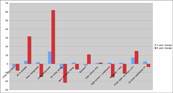
Aaanyway. My results do not really corroborate Gigerenzer et al’s research in any way, other than to show that reduced levels of prior knowledge (less education, or not living in the UK, so presumably knowing less about companies big in the UK) seem to offer some damage limitation at least. I’ll come back to this, but let’s have the results. Here’s the table and a graph:

  Constituents Population sample 1 year change (%) 5 year change (%)
FTSE 100 index 100   -2.5 -7.5
All in sample 92   3.5 31.8
Most recognised 10 100 2 -14.8
Least recognised 10 100 14.2 62
UK most recog. 10 87 -5 -21.5
Non-UK most recog. 10 13 1.6 -6.1
Random 10   -1.4 10.9
High school only 10 8 1.1 1.4
High school + undergrad 10 50 1.5 -15.1
Postgrad + PhD 10 50 1.5 -10.9
FTSE 1984 survivors (07) 37   7.3 14.9
10 most capitalised 07 10   2.8

-3.3

ftse 100 experiment

To explain further, ‘constituents’ means the number of companies in each ‘portfolio’. I’ve put the FTSE Index at the top, though this is a weighted index so doesn’t actually reflect aggregated share prices, which is what all the other figures are based on. The population column relates to the number of people (in my survey) relevant to each portfolio. Where possible I took the closing share prices on 13th February 2007, 14th February 2011 (13th not a trading day) and 13th February 2012. There are only 92 companies in my final sample because the other 8 didn’t exist back in 2007. If I’d done more prior research, rather than starting this on a whim, I’d have realised companies come and go from the FTSE 100 every quarter. The various portfolios are thus:

  • all in sample: ie all 92 companies – clearly performed well, but it’s unlikely anyone would actually have assembled such a portfolio, so it’s really just to show what the subsets are working against
  • most recognised = the 10 companies most recognised across my survey takers. Performed very badly over 5 years!
  • least recognised = the bottom 10. Hugely successful, and rather undermining the recognition heuristic!
  • the next few break down into UK-based and non-UK-based respondents, and levels of education; of course the non-UK and school-only groups have very sample populations, so the data is not perhaps that useful – but as I mentioned above, the groups with what might be expected to be the least knowledge of the UK markets… do a bit better
  • out of curiosity I also tracked down a list of the original members of the FTSE 100 when it launched in 1984. In 2007, only 37 of these were still in the index, so I made a basket of those… and it did pretty well
  • finally, a small portfolio based on the top 10 most capitalised members of the FTSE 100 in February 2007. As any motley fool knows, a lot has happened in the last five years (ie a recession).

So what’s behind the poor performance of the recognition heuristic in this study? Some possibilities:

  • The recognition heuristic might be hornswaggle and Gigerenzer just got lucky
  • Poor study design – obviously one would choose to track portfolios forward from now rather than using companies currently successful
  • Poor sample selection: ie too many smart-arses read Twitter
  • The recession has particularly hit banking and retail firms, which generally seem to dominate those people recognise most.

But I do find an interesting by-product of all this: the companies which have survived in the FTSE 100 longest (not worrying about cases where they may have fallen out and come back in again) do provide a respectable portfolio. So there’s something just in longevity – unless you’re Woolworth, Cadbury, HBOS, etc etc etc. Today there are 33 companies left from the original line-up (a few under different names). Send me a fiver and I’ll tell you who they are 🙂

Bibliography

Borges, B., Goldstein, D. G., Ortmann, A. & Gigerenzer, G. (1999). Can ignorance beat the stockmarket? Name recognition as a heuristic for investing. In G. Gigerenzer, P. M. Todd & the ABC Research Group, Simple heuristics that make us smart (S. 59–72). New York: Oxford University Press.

Ortmann, A., Gigerenzer, G., Borges, B. & Goldstein, D. G. (2002). The Recognition Heuristic: A Fast and Frugal Way to Investment Choice? in Handbook of Experimental Economics Results, 2008, vol. 1, Part 7, pp 993-1003, Elsevier.

Gigerenzer, G. (2007) Gut Feelings: The Intelligence of the Unconscious. Viking.

Disclaimer: I know nothing of the stock markets and am a dilettante statistician.


Animal words are strange fishes

I’m currently editing a book about a zoo. One of the things it’s drawn my attention to is the oddity of animal plurals. Discounting irregular forms such as ‘geese’ and pedantry such as ‘octopodes’, there seems to be a whole thorny area around what are known as ‘zero plurals’, where the plural is the same as the singular. There is a small list of canonical examples:

  •     deer
  •     moose (though I wish it were ‘meese’)
  •     sheep (disregarding Vi Hart’s proposal)
  •     bison
  •     salmon
  •     grouse
  •     pike
  •     trout
  •     fish
  •     swine

Our old friend Wikipedia says: ‘As a general rule, game or other animals are often referred to in the singular for the plural in a sporting context: “He shot six brace of pheasant”, “Carruthers bagged a dozen tiger last year”, whereas in another context such as zoology or tourism the regular plural would be used.’ This is corroborated in a PDF I found from the University of Granada (yeah, OK, not the leading source for English grammar, perhaps): “Nouns referring to some other animals, birds and fishes can have zero plurals, especially when viewed as prey: They shot two reindeer. The woodcock/pheasant/herring/trout/salmon/fish are not very plentiful this year.” And thanks to Colin Batchelor for pointing out that Eric Partridge (of Usage and Abusage fame) regards this as a snobbish usage by big-game hunters; and further that the Cambridge Grammar of the English Language (CGEL) includes the above words as ‘base plural only’, then elk, quail and reindeer as ‘base or regular plural’, and elephant, giraffe, lion, partridge and pheasant as ‘base plural restricted’.

(In the book I’m editing, the writer sometimes writes phrases such as “tapirs and capybara”, but has “tapir” as plural elsewhere. I imagine the capybara example is explained by subconsciously thinking that it is a Latin neutral plural. Doing a bit of crowdsourcing with Google reveals that for both animals the -s form appears far more in phrases referring to ‘two’ or ‘a pair of’ both types of creature, and indeed for the much-victimised pheasant, suggesting people do generally favour a simple English plural rather than the snobbery of the hunter.)

Andrew Carstairs-McCarthy’s Introduction to English Morphology expands on the ‘prey’ theme:

…there seems to be a common semantic factor among the zero-plurals: they all denote animals, birds or fish that are either domesticated (SHEEP) or hunted (DEER), usually for food (TROUT, COD, PHEASANT). It is true that the relationship is not hard-and-fast: there are plenty of domesticated and game animals which have regular -s plurals (e.g. COW, GOAT, PIGEON, HEN). Nevertheless, the correlation is sufficiently close to justify regarding zero-plurals as in some degree regular…

Hm, does “not hard-and-fast” really mean the same as “sufficiently close”? It’s not what I’d call a rule – more a matter of usage as Partridge suggests. And there are non-animal counterexamples such as ‘aircraft’ in any case.

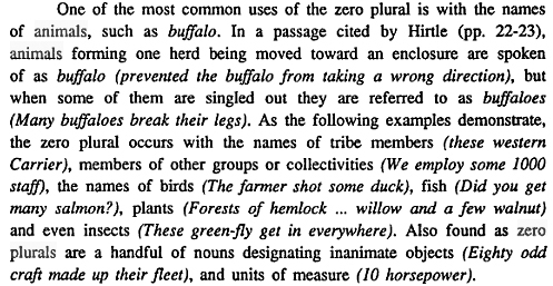
And hang on, what about this buffalo madness from Mark A Wickens’ Grammatical number in English nouns:

Zero plurals

And let’s not get into the whole fish/fishes pond (Wikipedia: “Using the plural form fish could imply many individual fish(es) of the same species while fishes could imply many individual fish(es) of differing species” and so on.) Or indeed the other buffalo madness.

As far as I can see this is a grammatical minefield and nobody has a cleer steer. Or should that be bison. As for the book, I’m going to err on the side of English plurals with -s unless there is a compelling reason not to, such as a lexicographer approaching me with a blunderbuss.

Shaking spears at each other

To question, or not to question. That is to be…

A recent conversation at LiveJournal prompted me to revisit the whole ‘authorship of Shakespeare’s works’ malarkey. As I commented there, I had always been firmly convinced that the Man from Stratford wrote the plays, and found things such as Baconian ciphers preposterous (in fact, I even found one of the typical ones worked just as well with bits of Waiting for Godot...) – but seeing Mark Rylance’s play ‘The BIG Secret Live—I am Shakespeare’ made me much more doubtful. Such is the power of drama, eh?

Anyway, I’ve spent some time reading the (often venemous) claims of the Stratfordians vs the Anti-Stratfordians, if only to get my head round the actual evidence and what seems to make most sense. I find it hard to find unbiased summaries of the arguments, so I’ll at least attempt something like that here, albeit very briefly. I recommend this page at shakespeareauthorship.com for the Stratfordian arguments (HT to Colonel Maxim) and this free, new PDF ebook from bloggingshakespeare.com (despite it’s occasionally ad hominem approach – “Anti-Shakespearians … hardly smile, perhaps a characteristic of an obsessive mind.”). For the other camp, the only major work that isn’t trying to advocate for a specific alternative author is Diane Price’s Shakespeare’s Unorthox Biography – a useful page listing her 10 key criteria for what makes Shakespeare a biographical oddity also contains responses and counter-responses, which begin to sound like Woody Allen’s Gossage and Vardebedian. Another Anti-Stratfordian has posted a very useful chronology listing documents which reference ‘both’ the Man from Stratford and the Writer of the Works.

Aaaanyway. As far as I can see the main anti-Stratfordian points are:

  1. There is no  evidence of WS’s education (but of course absence of evidence is not evidence of absence, and at most one can simply say this supports neither camp’s argument)
  2. There is no direct literary correspondence with WS during his lifetime
  3. There is no direct evidence that WS was ever paid to write or that he received patronage (despite his requests of the Earl of Southampton)
  4. There are no extant manuscripts in WS’s hand (other than six shakey – hurr – instances of his signature, three on his will; and a much-argued-about Thomas More manuscript)
  5. There is no direct proof of his authorship during his lifetime.

The Anti-Stratfordians also like making a big deal over most legal (non-literary) documents spelling his name Shaxper, or Shackspeare, or various others without the middle ‘e’, while almost all of his works are attributed to ‘Shakespeare’ or ‘Shake-speare’ and similar variants. I don’t find this compelling either way as there are always counter-examples. I’m also ignoring the fact that WS’s will makes no mention of books or other literary matters, as this doesn’t prove anything one way or the other.

Back in the folds of academe, the Stratfordian case is supported thus:

  1. There was an actor called WS in the company that also performed the plays of ‘William Shakespeare’.
  2. The actor was also the WS from Stratford-upon-Avon. The chap from Stratford also had shares in the Globe Theatre.
  3. There is an abundance of evidence in the First Folio (from 1623, seven years after the death of the Stratford chap) that the playwright was the same man as the chap from the Midlands.

These three points are problems if you hold that:

  1. There could have been a conspiracy by actors and writers in the company to pretend the Stratford actor was also a gifted writer
  2. An interlineation in the Stratford man’s will giving money to two fellow actors was added later by someone else
  3. The only evidence during WS’s actual lifetime is circumstantial (true enough) and that a conspiracy (see 1) saw to it that the First Folio was a cover-up.

Mark Rylance, Derek Jacobi and others are behind a ‘Declaration of Reasonable Doubt’ about the author’s identity. I think in a very pedantic sense it is possible to say that it is possible to doubt that the man from Stratford wrote the plays, based on the admittedly unusually patchy documentary record. So they’re right there is ‘room for doubt’. But ‘how much room?’ is maybe the real issue.

Ultimately it all seems to boil down to two alternatives, and which one you find more palatable or least strange:

  1. A lack of direct evidence during the Stratford man’s lifetime for his authorship of the works
  2. A conspiracy of numerous writers and actors to maintain the cipher of ‘William Shakespeare’ as a cover for a person or persons unknown.

But as Charlie Brooker brilliantly expounded, all conspiracy theories rely on a triumph of paperwork over human reliability.

I’ve tried to be fair to both sides here, but I have to say I’m now back in the Midlands, as although (1) is at times troubling, and makes Shakespeare forever a man of mystery to some degree at least, (2) is just silly. I think. Probably.

What gets you Twitter followers? Part 3 of 3: content

Here’s the final part of my short series on mining data on around 50,000 Twitter accounts, as recorded by Twanalyst. Previously:

  • Part one looked at user profiles. Generally, the more you fill out your profile (description, avatar, background image etc), there seems to be a correlation with increased number of followers; and high-status description terms (‘entrepreneur’, ‘author’, ‘speaker’ etc) perform better than, er, low status ones (‘student’, ‘nerd’ etc).
  • Part two discussed friends counts, and frequency of tweeting. There is an unsurprisingly close correlation between the number of friends you have and the number of followers; and you’re better off tweeting less than 30 times a day to avoid putting off followers. (Remembering always that correlation doesn’t mean causation, fact fans!)

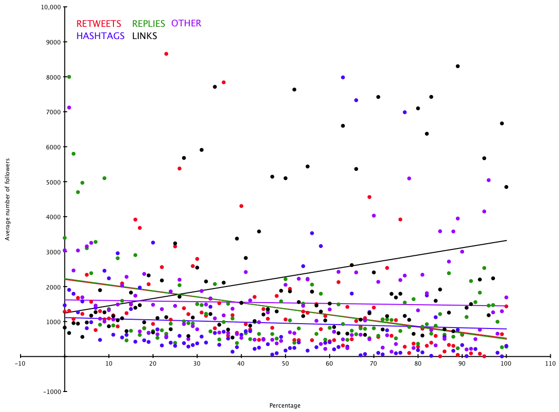
Twanalyst also records data on the ‘type’ of tweets people write. It divides them into five categories:

  • Replies/mentions – anything beginning with a @ goes into this pot (mean 35% median 34%)
  • Retweets – ie simply retweeting others’ content (with RT as the flag) (mean 5% median 1%)
  • Links – tweets that contain web links pointing elsewhere (mean 16% median 9%)
  • Hashtags – tweets that use a hashtag to participate in some group activity (mean 3% median 0%)
  • Everything else – ie just normal tweets that aren’t any of the above (what people had for lunch, random witticisms, or whatever) (mean 41% median 37%)

Obviously in reality these categories aren’t so discrete, but let’s live with that and assume everything falls into one or another. Twanalyst records each as a percentage of total tweeting output (it analyses the most recent 200 tweets).

Expressed as a graph of these percentages against average follower counts for each percentage point (I’ve chopped off a few extreme values due to accounts with hundreds of thousands of followers):

Tweet content/followers

The ‘lines of best fit’ are not hugely precise, but in broadly speaking it seems that there is a slight correlation between tweeting links and higher follower counts – people are interested in accounts which gather interesting stuff from elsewhere and tweet about it. The other values don’t really have any strong correlations.

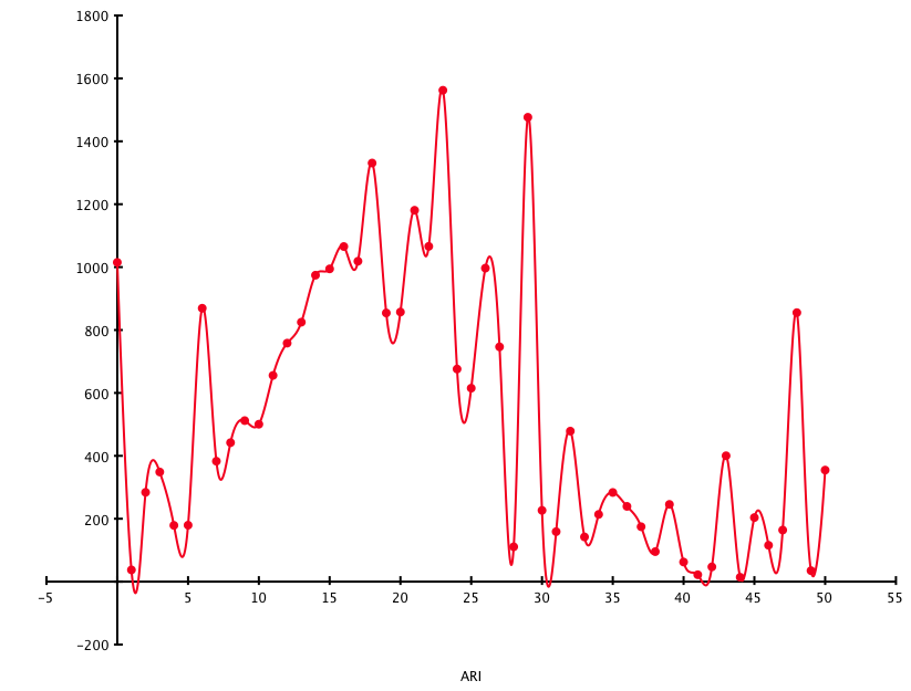
One final analysis. Twanalyst also calculates a user’s Automated Readability Index – ie a rough measure of the simplicity or complexity of the language they use. A figure of between 6 and 12 represents ‘normal’ prose: below is simplistic and much above enters the realm of obscurantism. (It should be noted though that because tweets often contain links, odd hashtags and so on, the ARI figure is of necessity a bit vague.) Here’s ARI (chopped off at 50, and ignoring twitter accounts with more than 100,000 followers) measured against average follower counts for each data point:

readability

Not much to add here, except the obvious: very simple and very complex writing styles seem to put people off (apart from an odd blip at ARI=48), but a reasonably level of complexity may actually be popular. Or it may all be coincidence. Over and out!

Simple methods get my vote

For the last decade I’ve been following the fascinating work of Gerd Gigerenzer and colleagues (especially Dan Goldstein) – as briefly as I can state it, he has identified a number of very simple heuristics which outperform far more complex models for decision-making processes or making predictions about certain kinds of data (this stuff has partly inspired my Feweristics project). The most accessible explanation of all this is in his book Gut Feelings, where he explains things such as the recognition heuristic, and how it can be used to predict the winner of Wimbledon, or build a stock market portfolio that outperforms many experts, and so on.

Now two researchers, inspired by Goldstein and Gigerenzer’s ‘take-the-best heuristic’ have applied the less-information-beats-more methodology to the US elections since 1972. You can read their paper, Predicting elections from the most important issue facing the country (PDF – I found it via Decision Science News, the work of GG’s collaborator Dan Goldstein), though the bare bones as follows.

In the abstract, authors Andreas Graefe and J Scott Armstrong say that their simple model, called PollyMIP, “correctly predicted the winner of the  popular vote in 97% of all forecasts. For the last six elections, it yielded a higher number of correct  predictions of the election winner than the Iowa Electronic Markets”. Basically, they used a database of pre-election polls to identify what voters thought was the single most important issue each time (this varied over time before the election, in some cases more than others), then used the same database to pull out poll results for which of the two candidates (ie Democrat or Republican) they believed would deal with that issue best (they looked at all polls up to 100 days before the election). In passing, they corroborated other research that the incumbent party always starts with an advantage. (The authors note in their paper: “In the real world, people usually have to make decisions under the constraints of limited information and time, which is why models of rational choice often fail in explaining behaviour.”)

In full, their PollyMIP heuristic works thus (taken verbatim from their appendix):

Step 1 (identifying the most important problem)
Search rule: Look up last available poll on the most important problem facing the country; sort problems in the order of importance.
Stopping rule: Stop search if there is a single most important problem. If two or more problems are of similar importance, average their importance with the results from the most recent previously published poll until a problem is identified as the single most important.

Step 2 (obtaining voter support for candidates on most important problem)
Search rule: Look up polls that obtained voter support on the problem identified in step 1.
Stopping rule: Stop search if there are one or more polls available. Average voter support for each candidate and calculate the two-­party shares of the incumbent. Move to step 3.
If no polls are available and the most important problem (as identified in step 1) is different from the previous day, move to step 2.A. Otherwise move to step 2.B.

2.A (most important problem different to the day before)
Stopping rule: Take the incumbent’s two party share of voter support from the last available poll on the most important problem. Move to step 3.

2.B (most important problem similar to the day before)
Stopping rule: Take the PollyMIP score (see step 3) from the previous day. Move to step 3.

Step 3 (determining election winner)
Decision rule: Average the incumbent’s two-­‐party share of voter support for the last three days, which is referred to as the PollyMIP score. If the PollyMIP score is above 50%, predict the incumbent to win. If it is below 50%, predict the challenger to win. Otherwise, predict a tie.

Or, more briefly: “(1) Identify the  problem seen as most important by voters, (2) calculate the two-­party shares of voter support for the  candidates on this problem and average them for the last three days, and (3) predict the candidate with the higher voter support to win the popular vote.

Not bad for predicting election results 97% of the time. I’d love to see whether this would work for Britain’s elections, too. (They used the iPOLL databank – anyone know if there’s an equivalent for the UK?)

What gets you Twitter followers? Part 2: friends and frequencies

I’ve been analysing data from 50000 Twitter accounts, recorded by my Twanalyst tool (tracks your Twitter stats over time, and analyses your tweeting style and personality). In Part 1, I looked at how people’s profiles might correlate with their number of followers, and a few trends emerged.

This time I’ve been looking at the relationship between follower counts and the following:

  • Number of friends
  • Time since joining Twitter
  • Number of tweets written
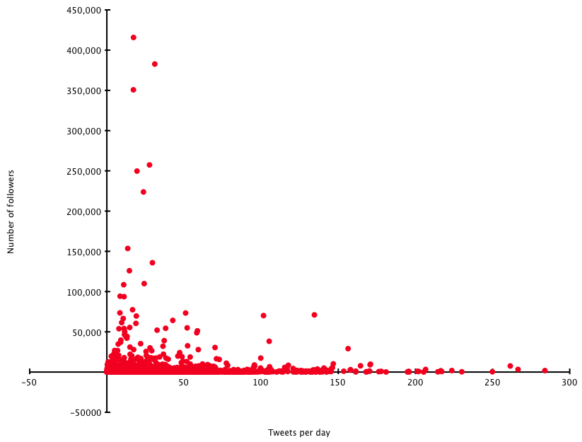
  • Average number of tweets written per day

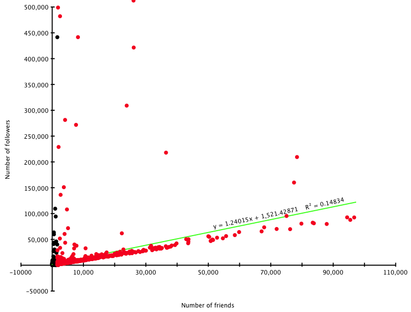
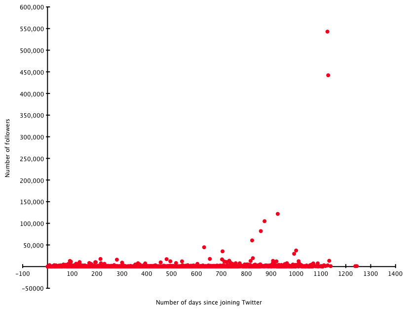
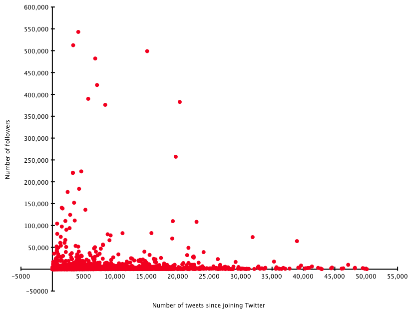
In each graph below, the X-axis shows the above data, with follower counts on the Y axis. The Y figures are averages taken for each value of X.

Friends

Friends/followers
Friends/followers

The green line is the estimated line of best fit by OmniGraphSketcher (excellent Mac graphing program) – though it seems slightly generous. (I’ve cut friends off at 100000, as the few data points above that are so high that the rest of the data becomes unclear.) Roughly speaking, and unsurprisingly, there’s a one-to-one relationship between friends and followers. Want followers? Make friends.

Time

Days/followers
Days/followers

Obviously you need to have been on Twitter for a little time to get followers – but overall there isn’t really any strong correlation noticeable between how long you’ve been using it and how many followers you have. It must be what you do with Twitter that matters, rather than simply Being There.

Tweets

Tweets/followers
Tweets/followers

This doesn’t seem to show much, either. What might be helpful is to measure this against time…

Rate

Tweet rate/followers

When you measure the average number of tweets per day (since joining Twitter, and I’ve ignored a handful of rates over 300/day), a broad message comes across that you’re best of tweeting up to around 30 times a day – above that, and you risk putting people off. Again, this isn’t exactly surprising.

So there aren’t really any profound observations here, sorry: the data seems to corroborate common sense.

In the third and final part of this series, next week, I’ll see if there are any correlations between tweeting style (as recorded by Twanalyst – number of retweets, posting of links, how much you reply to other people etc) and follower counts. Thanks for listening!

PS: I’m indebted to the UNIX BASH Scripting blog for an awk script that helped crunch this data.

What gets you Twitter followers? Part 1: profile usage

Running Twanalyst has given me access to large amounts of data, which I’m slightly-too-addicted to crunching. Inspired by this post at Social Media Today, which analyses the popularity of Twitter users according to the words they use in their tweets, I realised I have a large database of people’s Twitter biographies. Do the words people use in their self-penned descriptions have any influence on the number of people who follow them? (Well, presumably yes, given that ‘sod off and don’t follow me’ would be an ill-advised way of getting a large following.) But which words?

I’ll come back to that – first, some more general data.

I analysed around 50000 accounts with data stored at Twanalyst. The average number of followers was 1449. Some gleanings:

  • 66% of people gave a URL with their Twitter biography – they averaged 1984 followers, whereas those who didn’t give a URL averaged only 429
  • 50% of people use a background picture of some kind – they averaged 2196 followers, whereas those who didn’t use one averaged only 707 (more on the pictures in a moment)
  • 97% of people use an avatar (ie little icon) with their Twitter account – they average 1485 followers, whereas those who don’t average just 144
  • 80% of people provided a biography or description – they averaged 1541 followers, whereas those who didn’t averaged 183.

Of those who use a background picture, by the way, the most popular ones of those provided by Twitter are themes 1,2,5,9 and 10 (all with > 1000 users – 1 has > 10000) – but only theme 15 took the follower count above average, and that’s probably just because the Hollywood actor Neil Patrick Harris (with around 130,000 followers) uses it! (I haven’t mined whether using your own background picture is better than using one provided by Twitter, though the above data implies that.)

Back to the words.

I got rid of stop words, then mined the biographies for words (mostly nouns, plus a few selected adjectives) which describe someone’s role in life (whether career-based, such as ‘programmer’, or personal such as ‘wife’). The top 10 words (by popularity) were: geek, writer, student, developer, lover, father/dad, mother/mom, blogger, photographer and designer. I only looked at words used by 1% of by sample set or more.

The only words in the top 50 or so terms associated with above average follower counts were: blogger (2323 – remember the average was 1449), artist (1692), girl (1711), fan (1712), author (3681), entrepreneur (2663), director (1683), marketer (2541), expert (4273) and singer (2300). Some more details picked out (all figures are average number of followers where the description uses the term in question):

  • The worst terms (all with follower averages below 400) were student, developer, nerd, engineer and programmer – go figure! (Geek came in at 675, so also pretty low.)
  • Home life and gender: father/dad gets 845, but mother/mom gets 1202; girl gets 1711 but boy only 518; husband gets 868, wife 740; oddly the generic guy gets 1380.
  • Expertise: amateur gets 477, expert gets 4273 (but professional only has 969)
  • Although author gets 3681, writer gets only 906 – maybe people see ‘author’ as more established, and writer as more wannabe? (Editor fares averagely with 1409.)
  • Although singer gets 2300, musician only gets 585.

I can’t claim using the right words is a guarantee of a high follower count, of course – that must relate to what you write as well as who you are; but there do seem to be some general trends (eg expertise rates high, and nobody wants to read what students have to say!). Oh, and if you use the phrase follow me in your bio, the average follower count is 2418…

Another time I’ll mine some data about how people’s Twitter behaviour (eg how much they follow others, how often they tweet, what sort of tweets they write…) relates to follower counts too. Watch out for Part 2 some time in the next few weeks. If I find any more time (ha!) I might create a tool where you can look up terms yourself.

(Oh, and you can follow me at @hatmandu, of course!)

Edit (Part 1A!)

Here’s another angle on the same data set. Out of 39975 profiles which include descriptions, we find the following:

  • 1.5% have 10,000 or more followers. The top 10 ‘role-defining’ terms people in this subset use are: blogger (4.6%) author founder speaker writer entrepreneur host father/dad director marketer (2.2%)
  • 10.0% have 1,000 or more followers but less than 10,000. The top 10 terms here are: blogger (7.7%) writer geek father/dad entrepreneur author designer lover mother/mom founder (3.0%)
  • 44.2% have 100 or more followers but less than 1,000. The top 10 terms are: geek (5.7%) writer blogger designer student lover developer father/dad mother/mom photographer (2.7%)
  • 44.3% have less than 100 followers. The top 10 terms are: student (2.7%) geek writer designer developer lover guy fan mother/mom photographer (0.8%).

It’s noticeable that writer appears at all levels – from the hugely successful to the obscure and aspiring, just like in real life. It’s hard not to spot that the very top end accounts are full of founders and speakers etc. And the bottom: those pesky students again. I’m surprised blogger fares so well – but perhaps people like bloggers who write about a specialist subject?

Part II next week!

What’s it all about, Alfie

I’ve just launched a new tool at Hatmandu.net, a text content and keyword analyser – in theory useful for search engine optimisation, but also to get the general gist of a text.From the notes:

This text content and keyword analyser is intended to give a more precise indication of a text’s most important words than other tools available. Most keyword analysers use simple word frequency (which is also shown here anyway), but that doesn’t relate the specific text to the language in general – common terms such as ‘people’ and ‘time’, for example, appear in many documents, but do not necessarily indicate the essence of the particular text being analysed. This analyser uses the TF-IDF statistical method to relate the frequencies of words in the specific text to their general frequencies in the British National Corpus. I am indebted to Adam Kilgarriff‘s version of the BNC, which I have adapted considerably for this tool. This analyser mainly uses the nouns in the BNC, on the basis that these are the parts of speech that best indicate the subject matter of a text. (At some point I hope to produce a version using an American English corpus, though I’d be surprised if the results were very different.)

It works with Twitter accounts (though it only reads the last 200 tweets, which may not form a usefully large body of text), and URLs where my humble scraping tool is able to extract the text successfully – most useful is the ‘paste text’ field, which will accept up to 1Mb of text (about 200,000 words) – so will analyse entire books if desired. Livejournal users can enter their URL (http://username.livejournal.com) assuming their account is public.

It’s a bit experimental at the moment, but hopefully might migrate from ‘possibly fun’ to ‘possibly useful’ in due course!

The narrative of illness

So, yesterday I was felled by illness. The night before, I lay wake hour after hour, aching and uncomfortable with stomach pangs. As the day went on, I felt worse, with hot and cold flushes, more pangs, total exhaustion, and I crept back into my bed for much of the day for further fretful sleeplessness. Even one of usual salves – watching one of the Peter Sellers Pink Panther movies – failed, as I just couldn’t concentrate. Inevitably, feverish thoughts roved to whether I had the dreaded swine flu.

Today, the day began with some queasiness, but as time has gone on I feel immeasurably better – I’m chipper, punning and have a renewed bounce in my step. Whatever battle my body was fighting, it reached some low points but it eventually won.

Which is what made me think of the parallel with narrative. Kurt Vonnegut said all stories boil down to ‘Man in a hole’: “Somebody gets into trouble and gets out of it. People never get tired of this.” Legions of Hollywood screenwriters (eg Blake Snyder, whose Save the Cat! book is quite interesting – and I’ve only just discovered he died a few weeks ago; or Christopher Vogler, who applies Joseph Campbell’s ‘hero’s journey’ analysis of myth to blockbuster movies) have made a career out of amplifying Vonnegut’s summary into detailed scene plans for film scripts. Everyone knows there are only three, seven, 20 or 36 plots (or eight, nine, 37, 69…) – or just one, really.

All of life is full of these little mini-dramas, overcoming challenges, confronting enemies, battling illness. It’s no bloody wonder we like stories so much – especially the ones where we win.